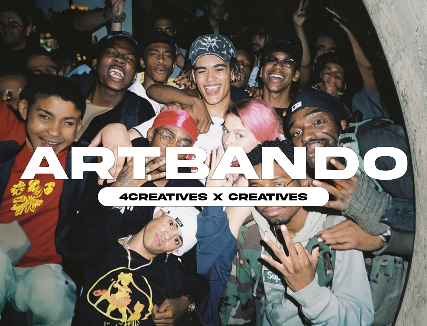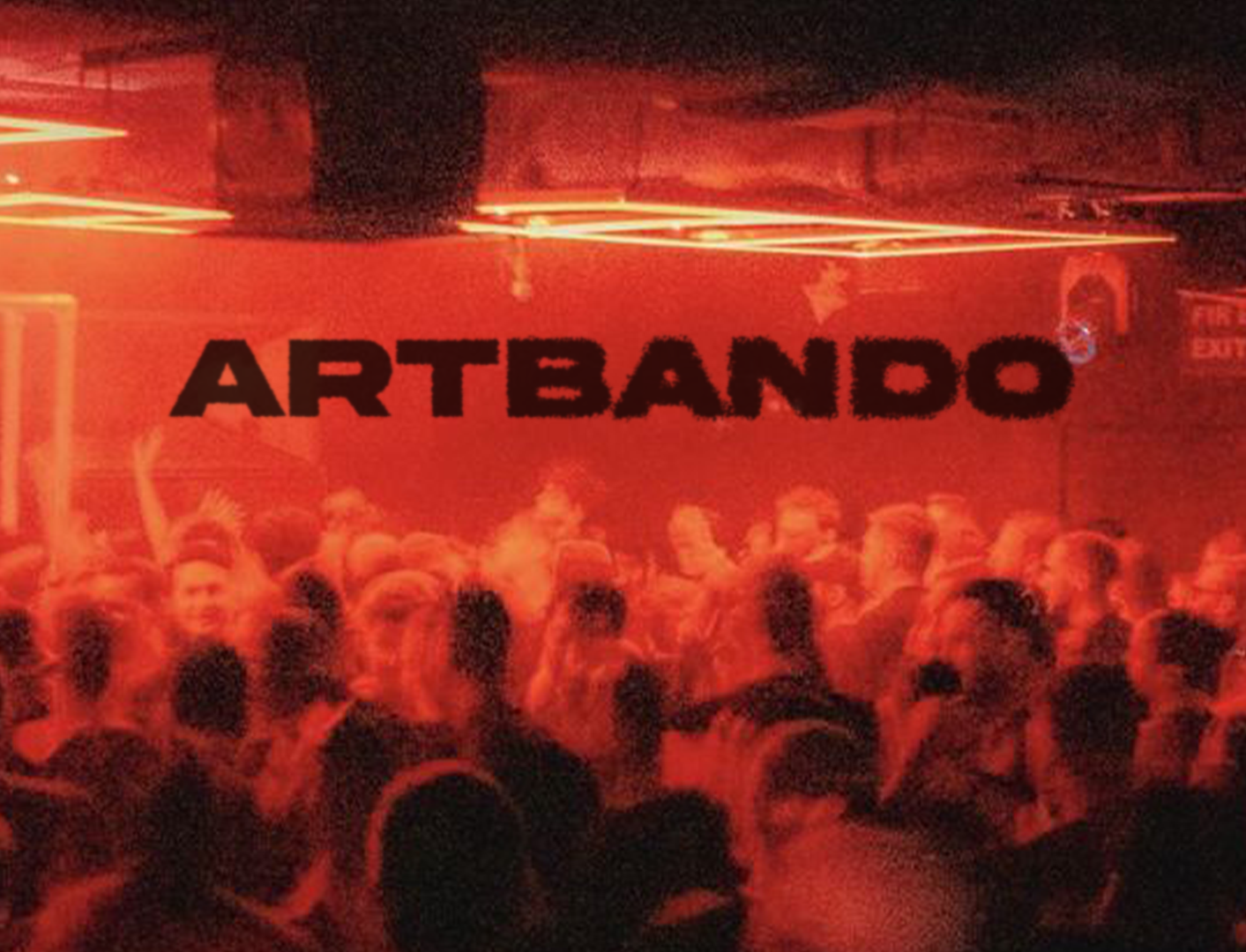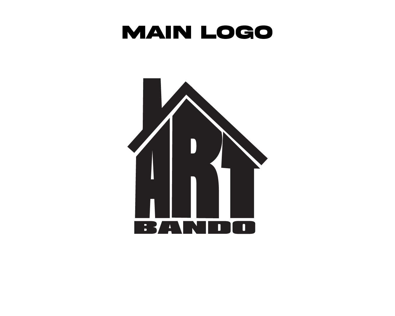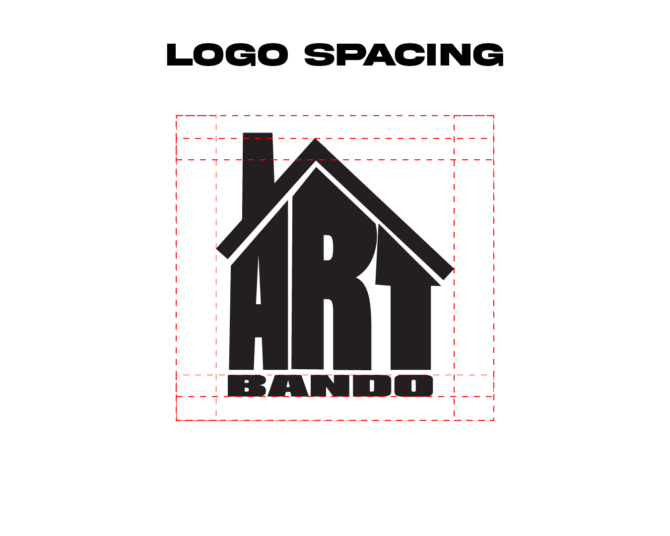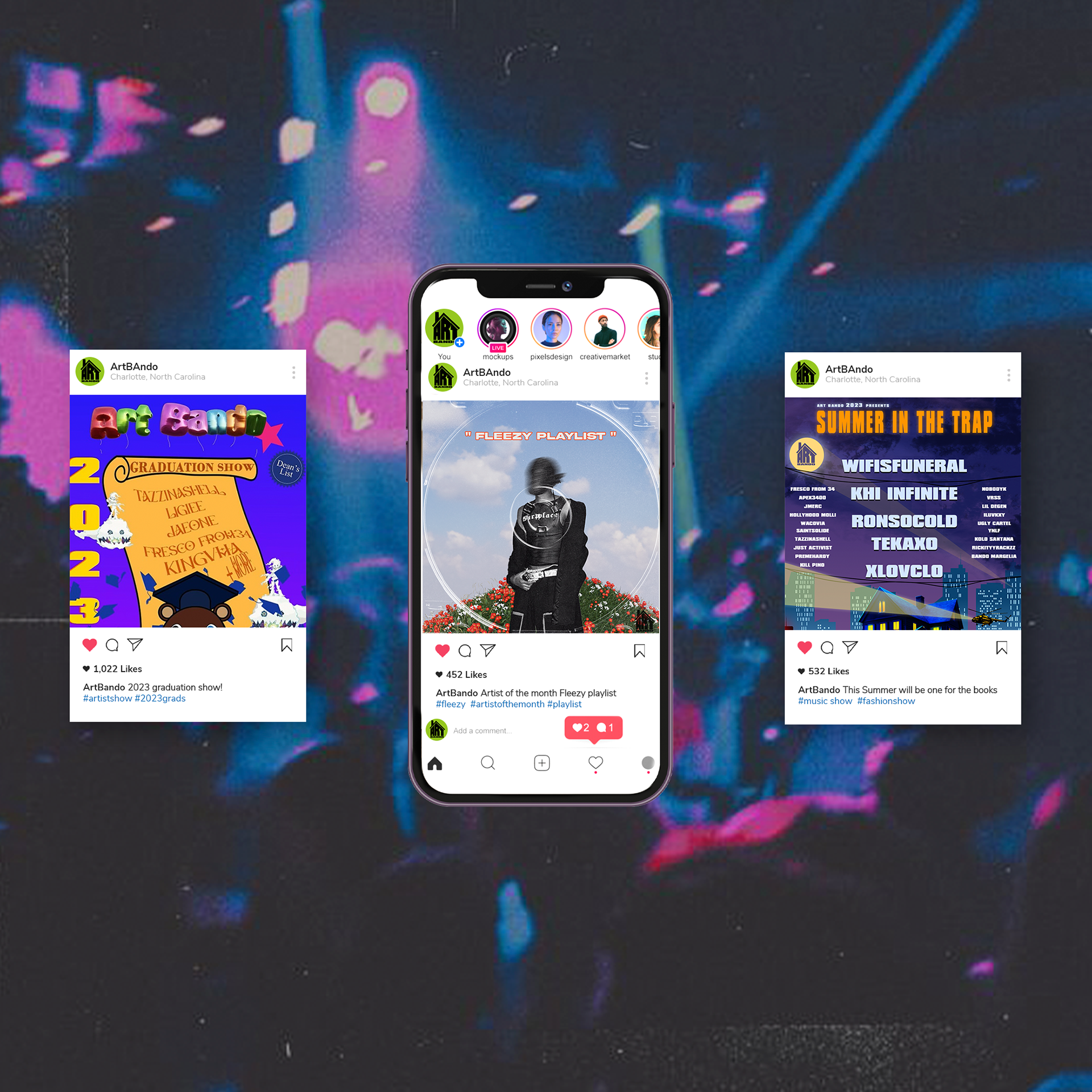

ARTBANDO
2023
SYNOPSIS
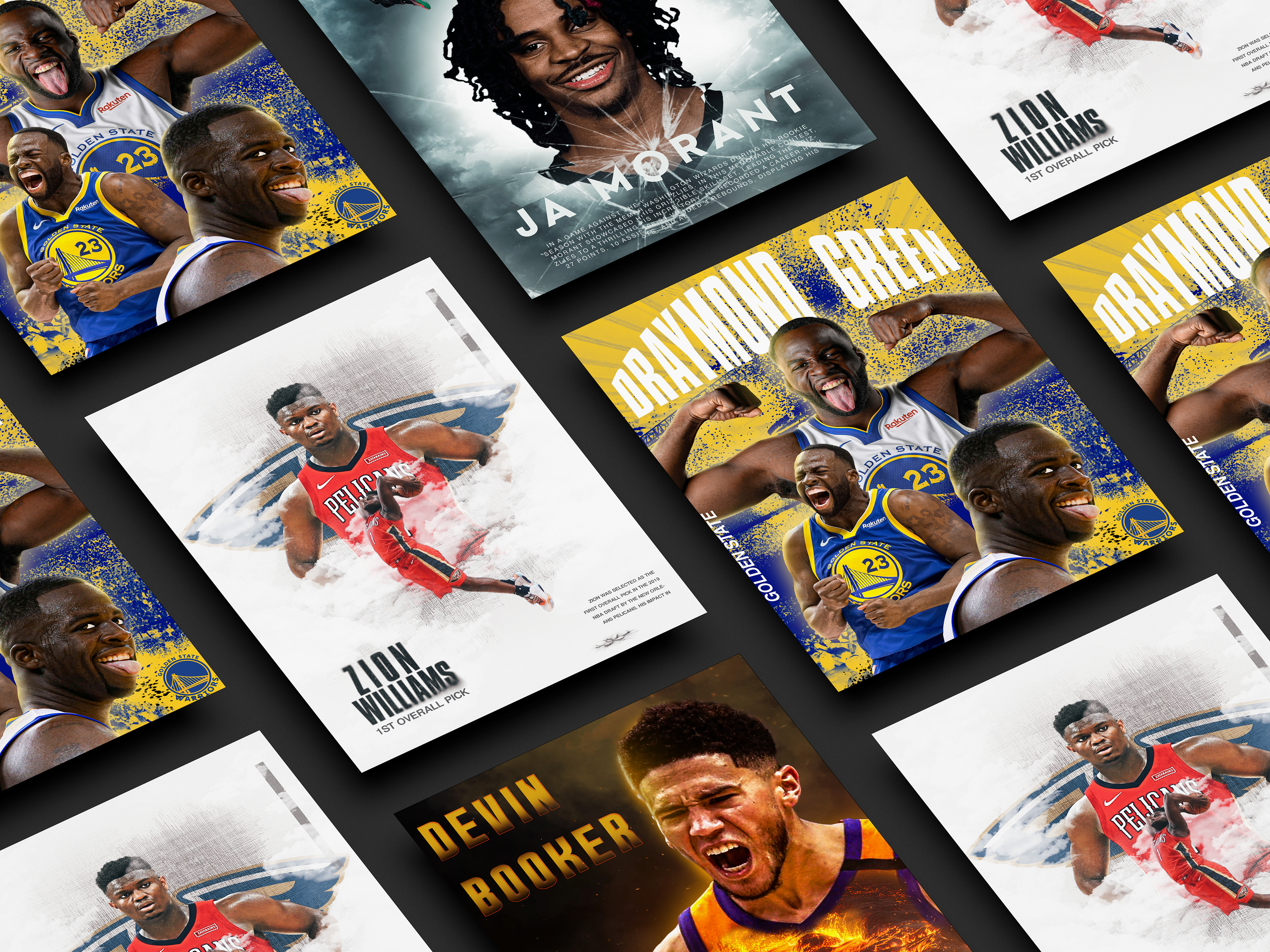
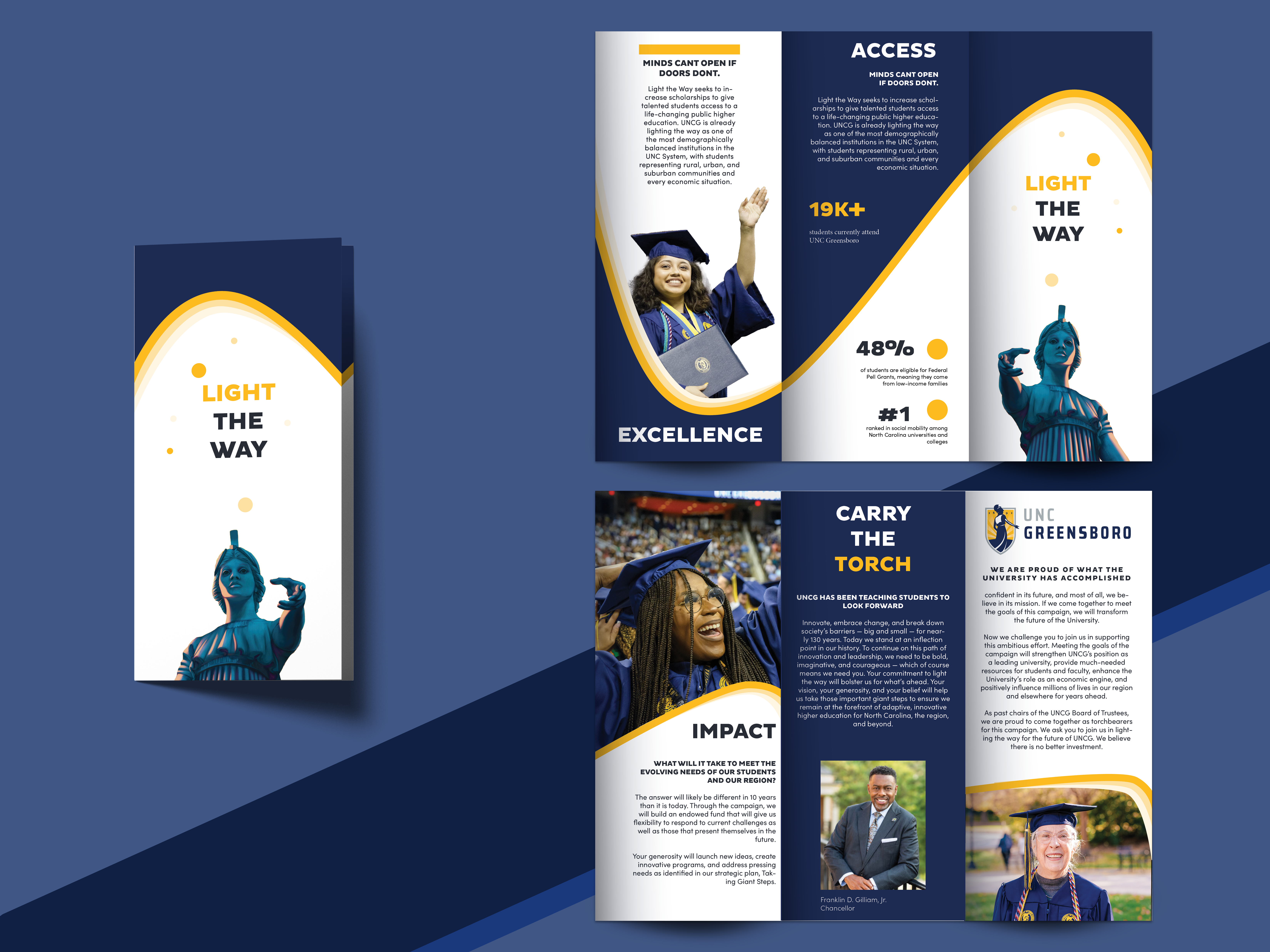
Artbando is a dynamic collective that champions underground creatives through immersive events and collaborative showcases. Rooted in the vibrant cultural scenes of North Carolina. I was tasked with creating a full brand layout, including logo, mock-ups, social media campaigns, and print pieces.