Role
Lead Designer
Project Scope
Brand design, Logo design, Color palette,
Editorial design
Goal
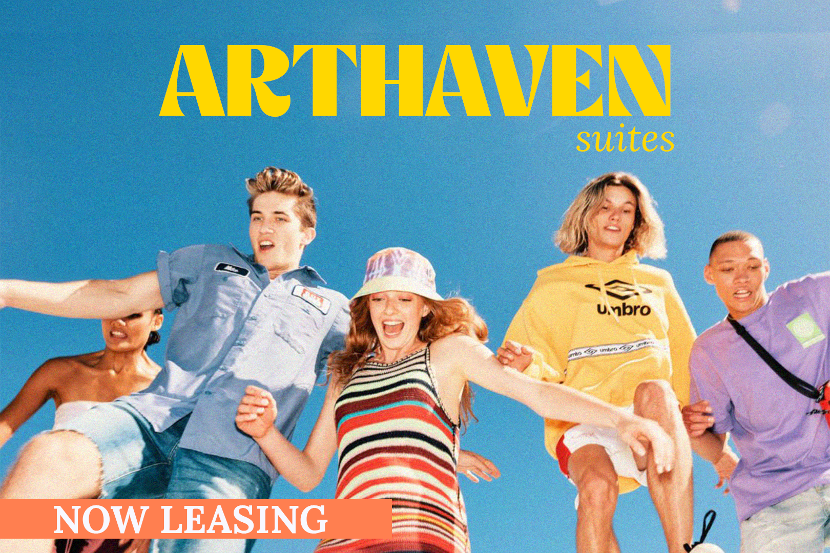
Create a complete brand identity that encapsulates the brand of Arthaven Suites. Creating an atmosphere that gets young artists excited to live in Arthaven Suites. Creating emotions of excitement, empowerment, community, and timelessness.
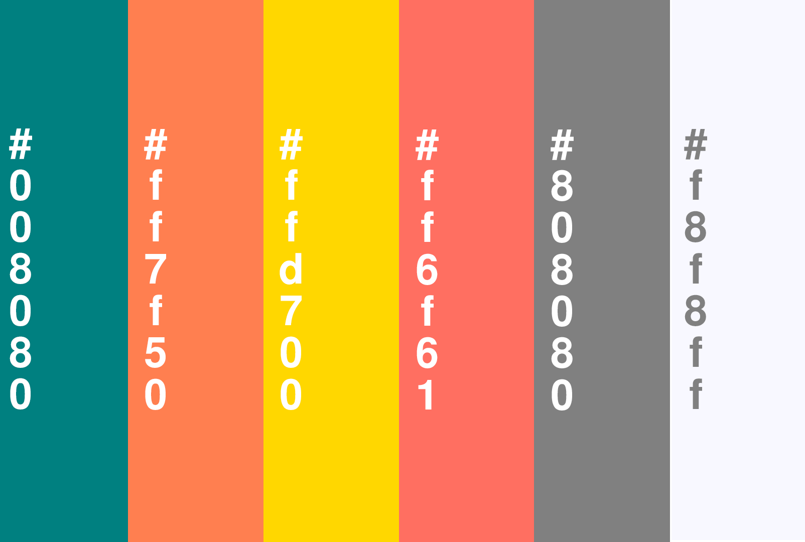
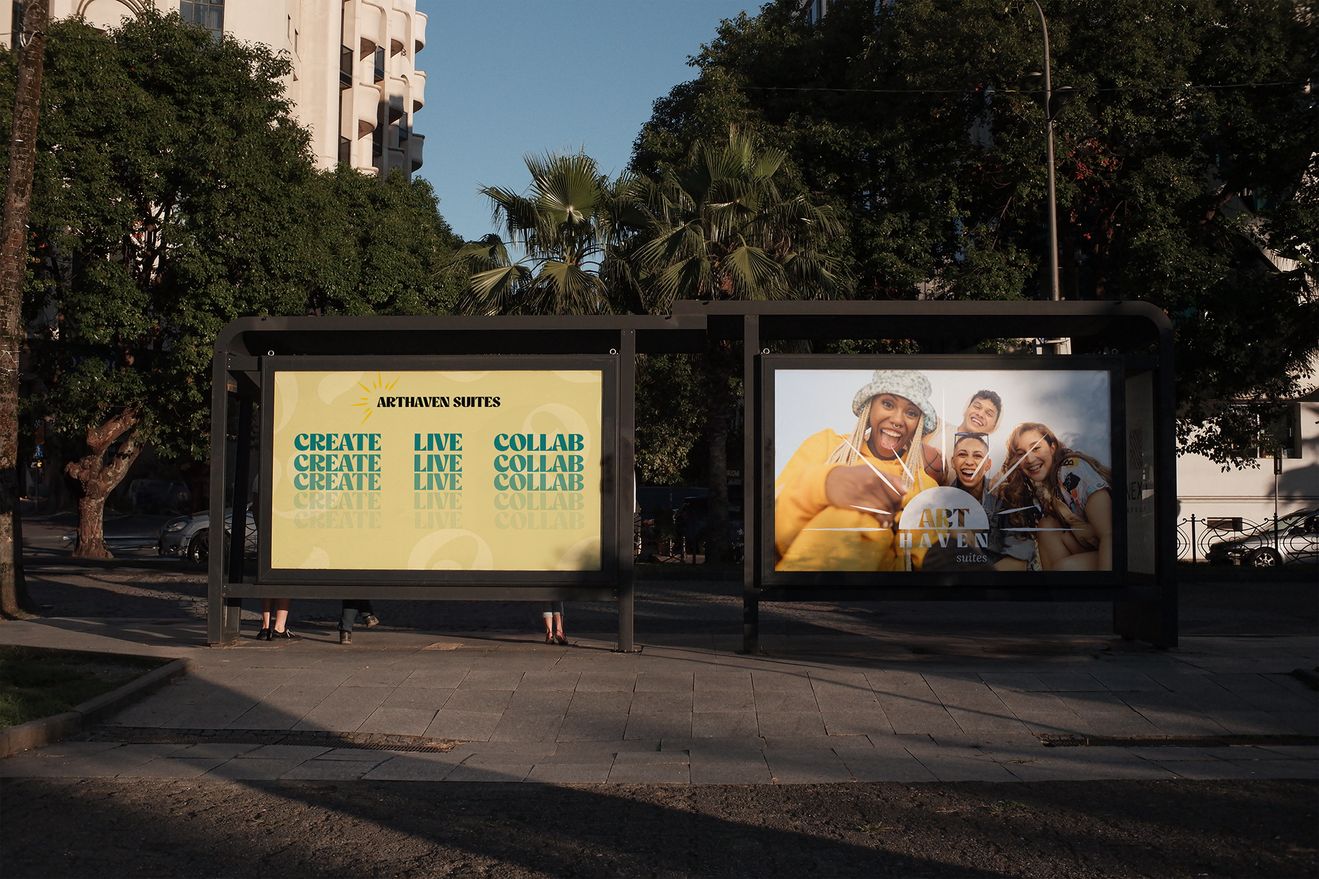
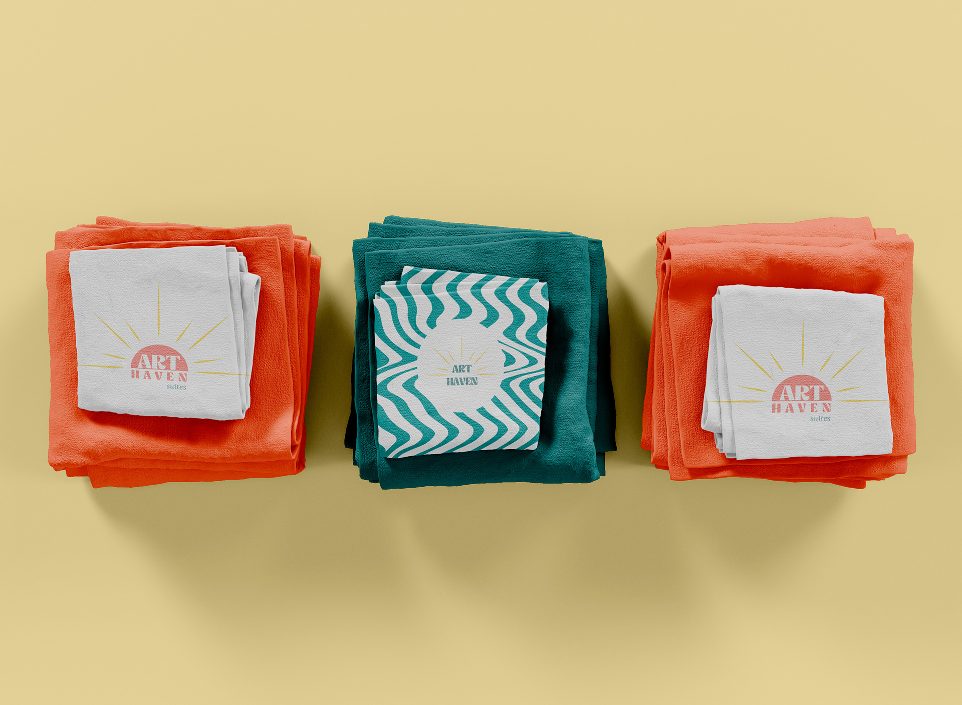
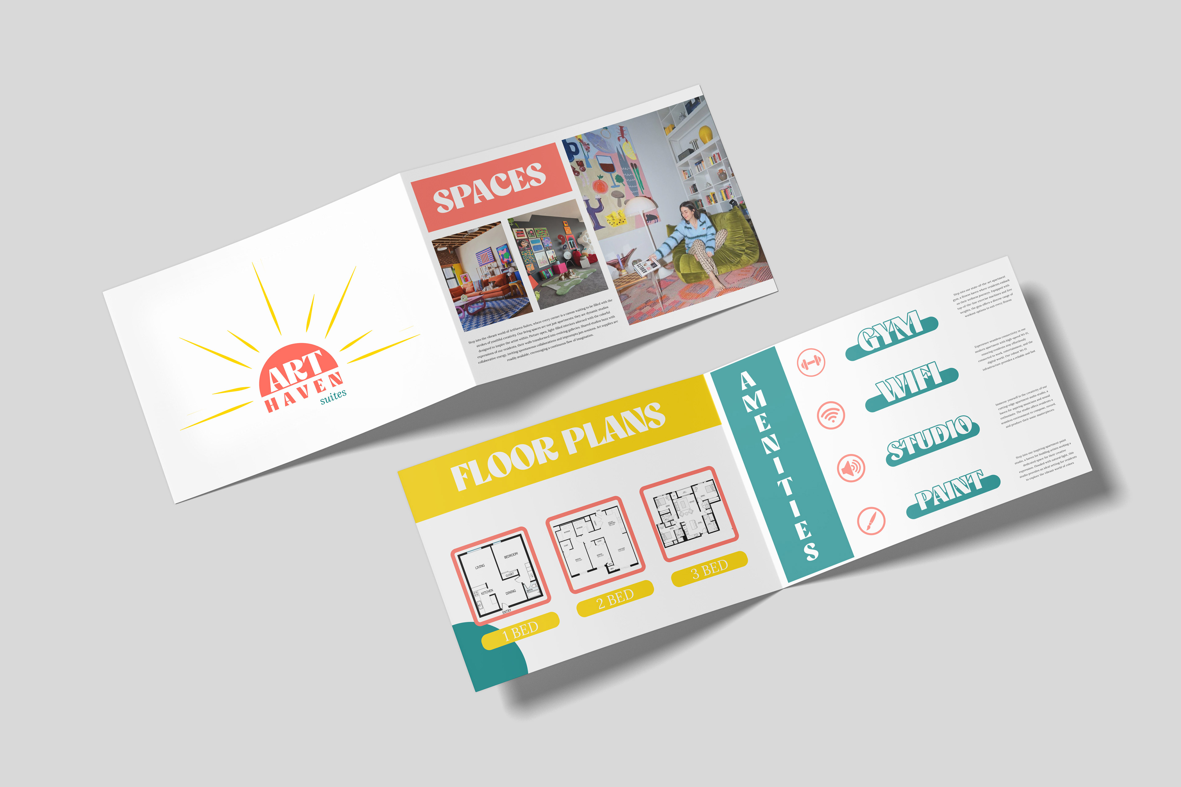
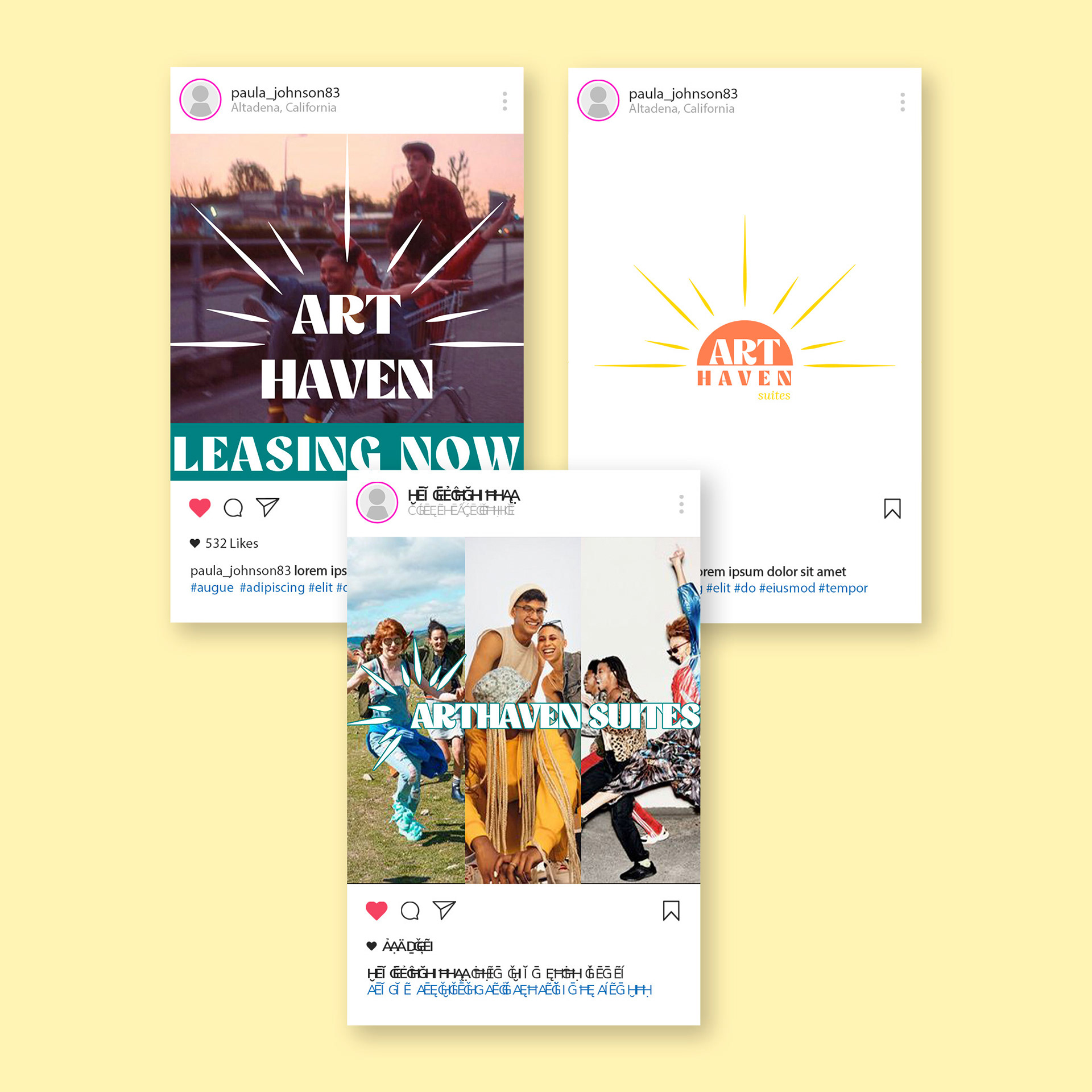
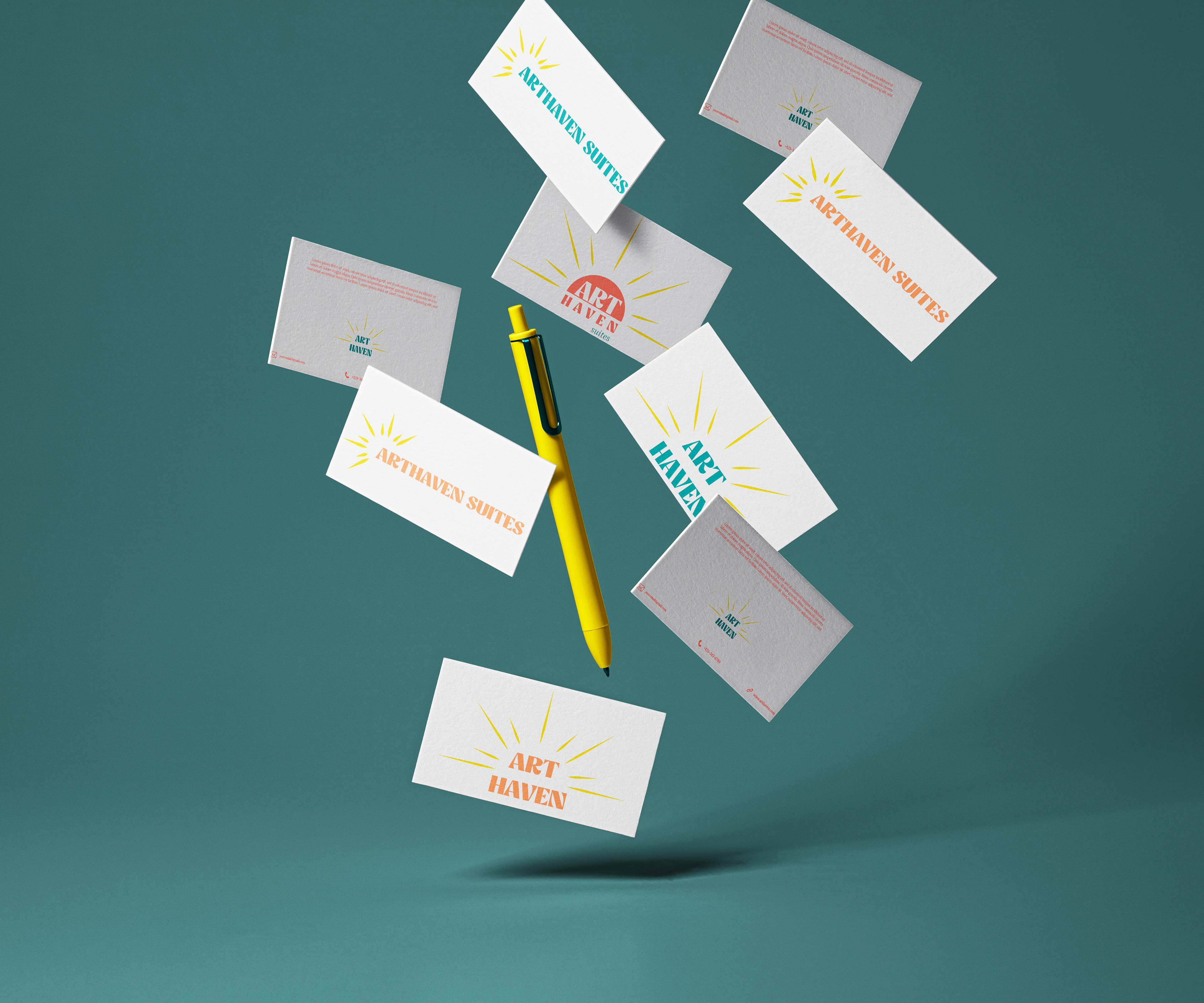
This color palette creates a visually stimulating environment that speaks to the dynamic and diverse nature of artistic expression. The teal and coral hues evoke a sense of energy and passion, while the gold adds a touch of luxury and warmth. Salmon contributes a playful yet refined element, and the subtle gray and ghost white provide a neutral backdrop, allowing the vibrant colors to pop. This carefully curated color palette aims to capture the essence of our young artist community—bold, expressive, and contemporary—setting the stage for a living space that fosters inspiration and individuality.
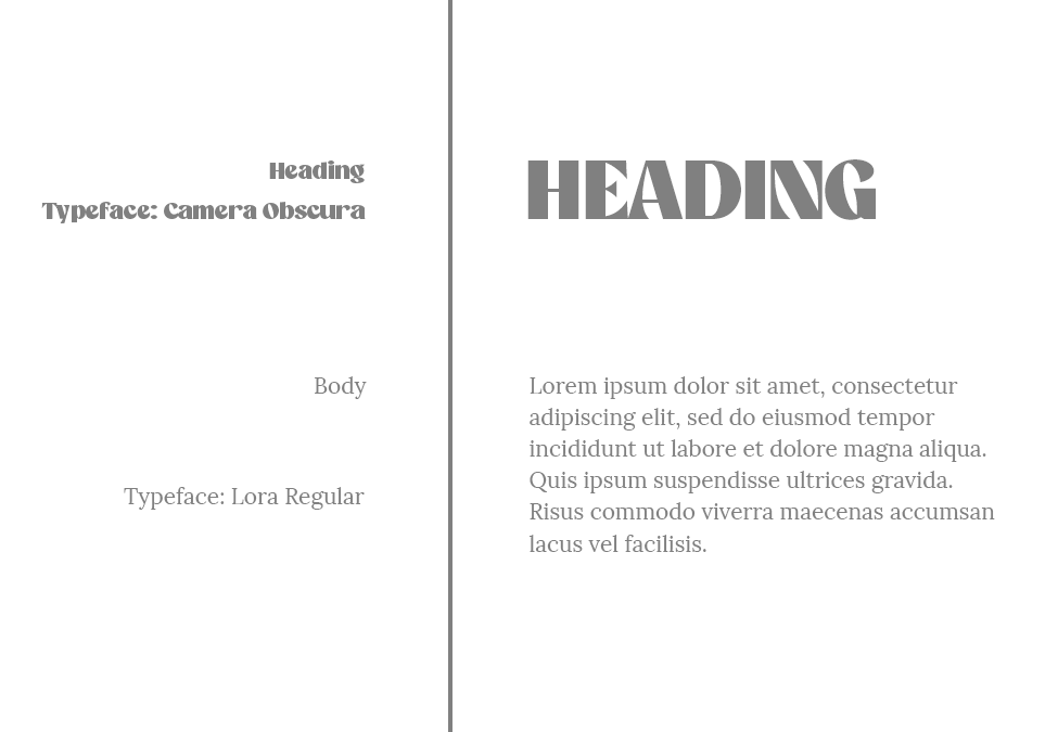
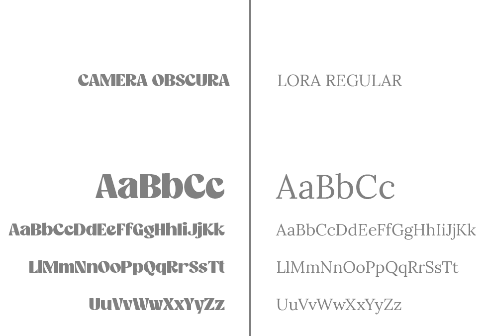
In shaping the branding for Arthaven Suites, the fonts Camera Obscura and Lora Regular have been chosen to convey a unique blend of contemporary aesthetics and classic elegance. Camera Obscura's distinct letterforms, reminiscent of hand-drawn sketches, capture the artistic spirit and creativity that define our community. Paired with Lora Regular, a font known for its graceful and timeless appeal, we achieve a harmonious balance that resonates with the sophistication and aspirations of our residents. The combination of these fonts not only communicates a sense of artistic individuality but also reflects the modern yet timeless atmosphere we aim to cultivate. It's a typography choice that speaks to the creativity and refined taste of our target demographic, creating a brand identity that is both inviting and inspiring for young artists seeking a distinctive living space.
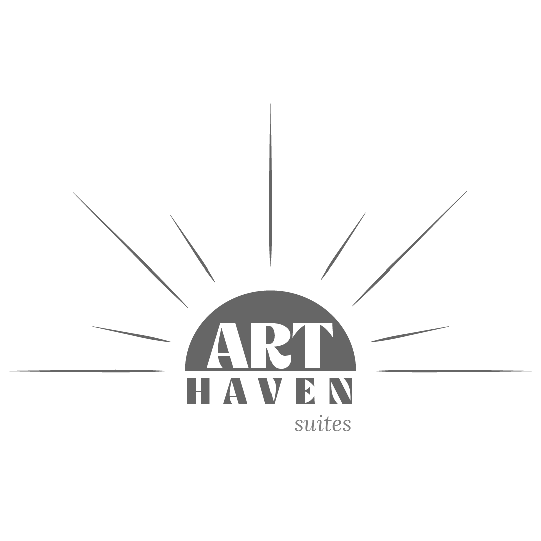
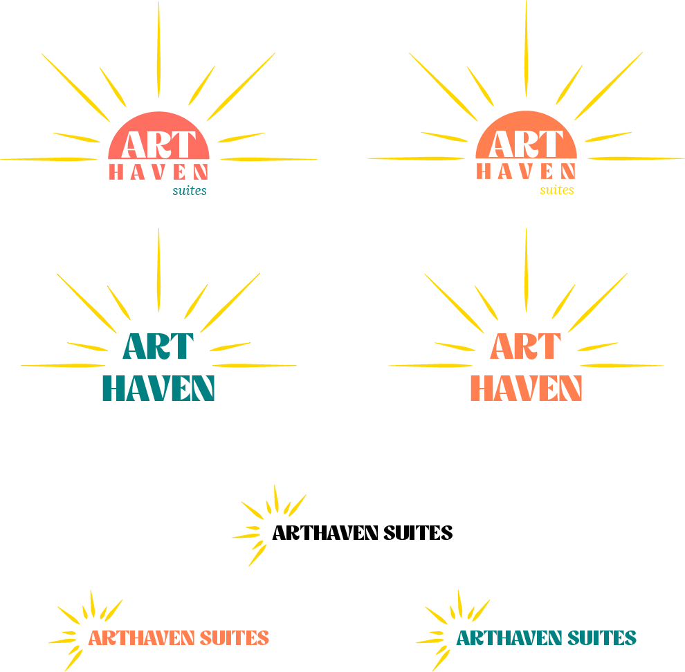
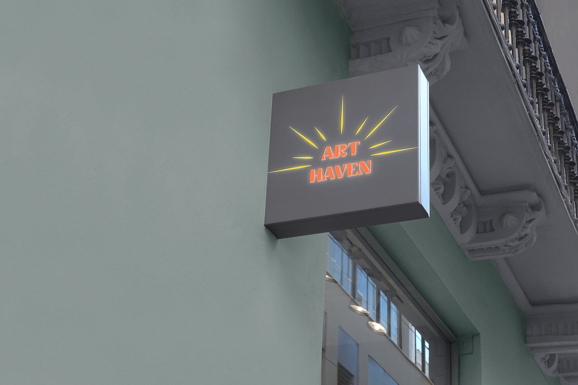
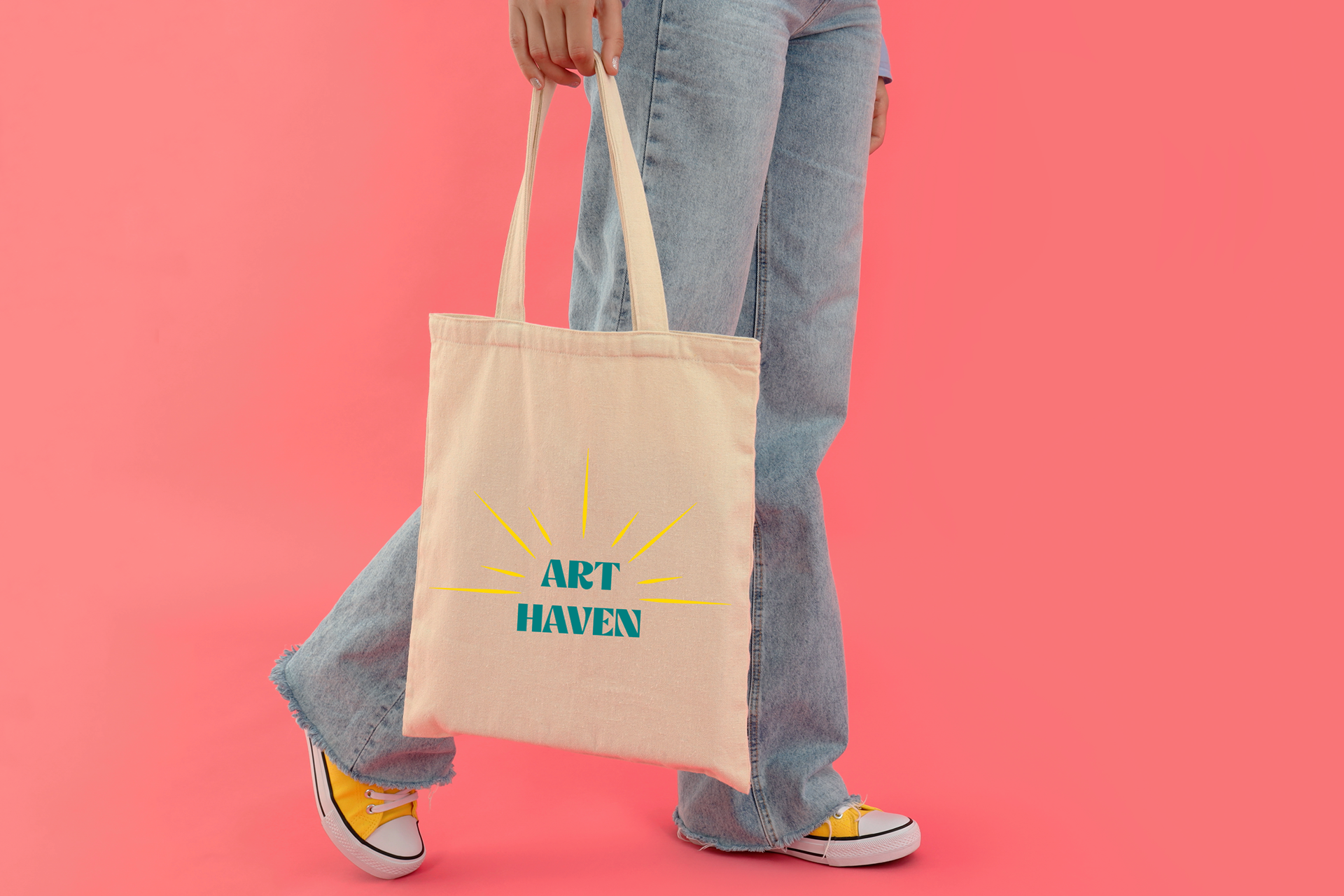
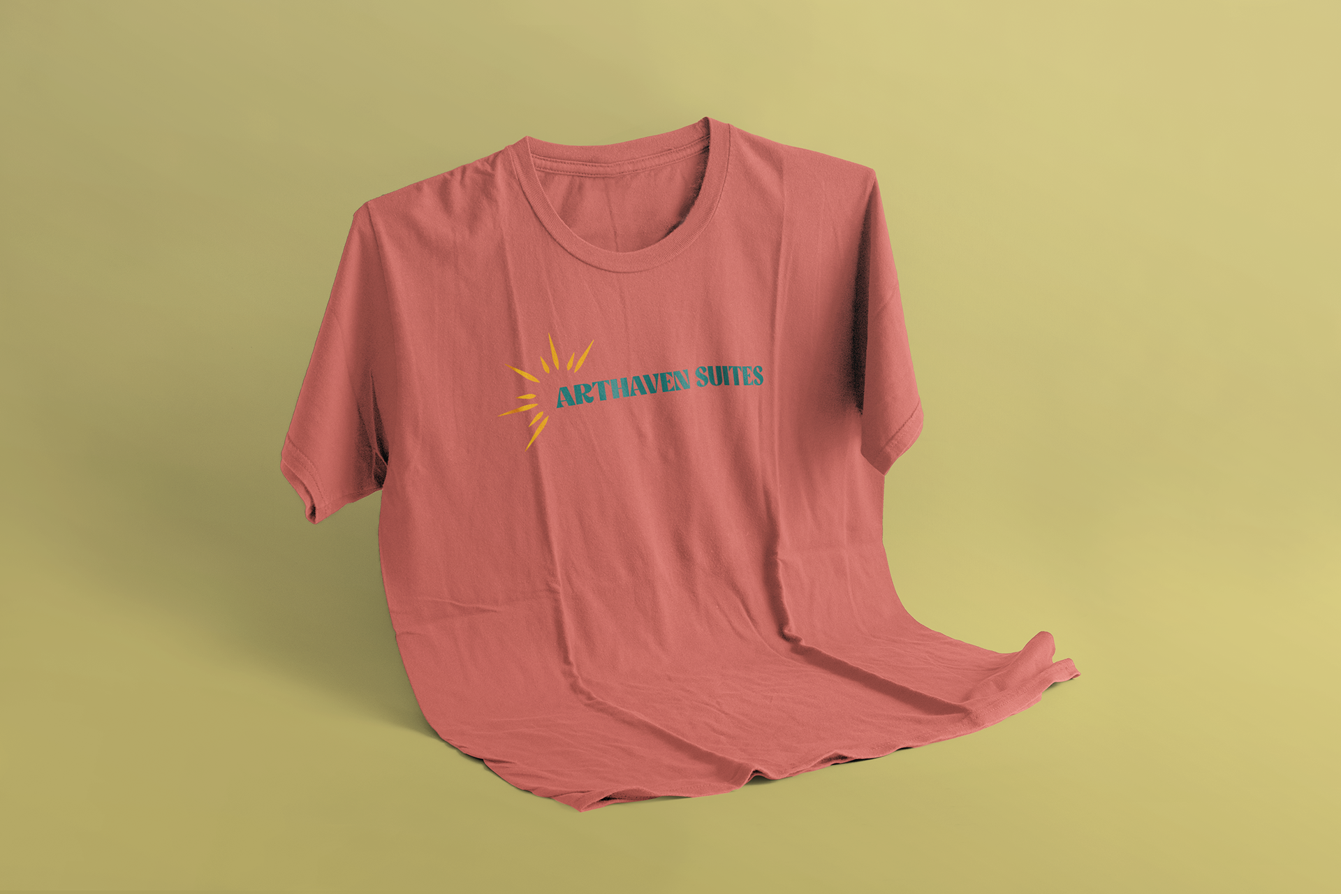
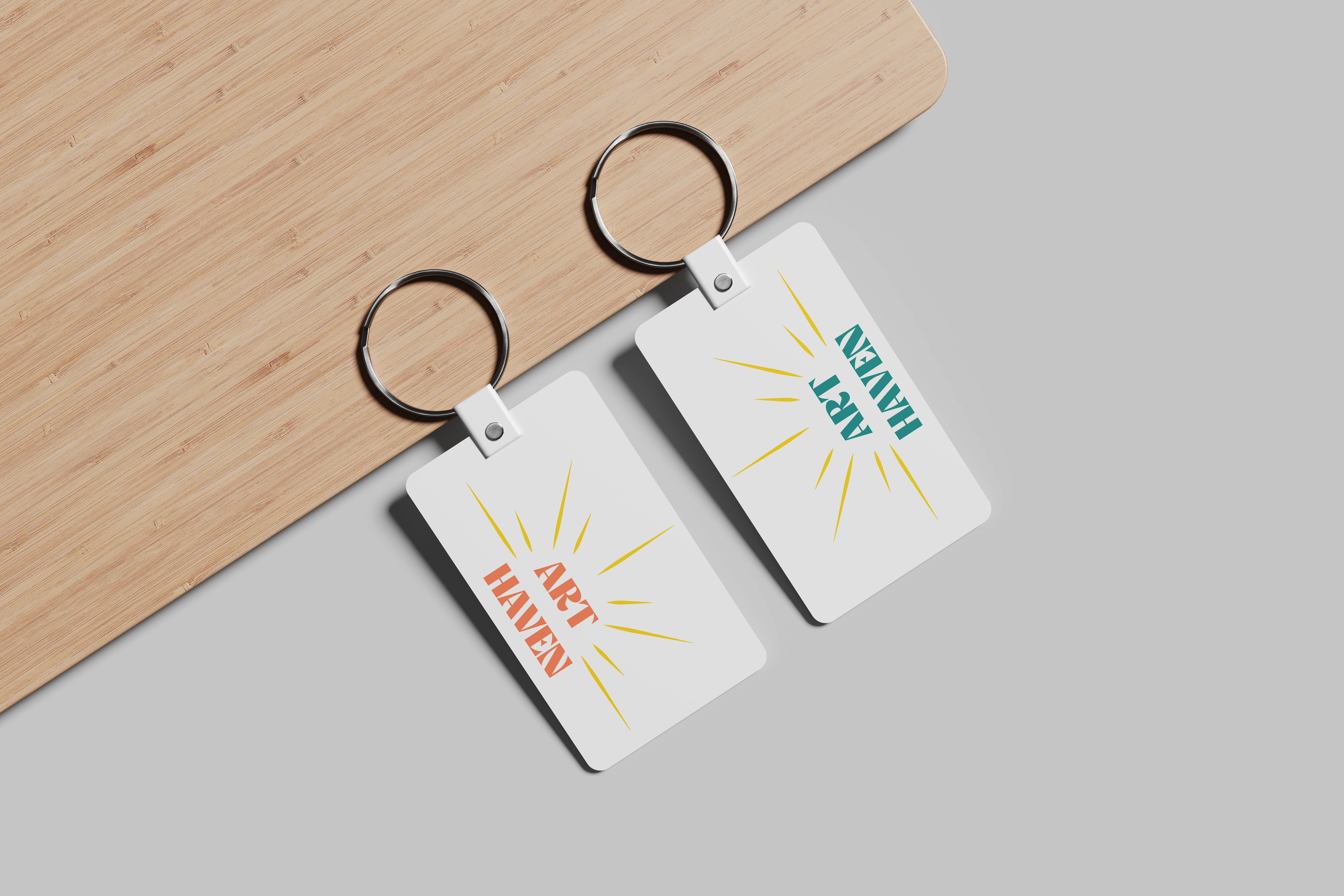
In creating the logo I sought to integrate the name into a captivating sun design, symbolizing creativity, warmth, and a vibrant community. The central placement of "Arthaven Suites" within the sun's core reflects the focal point of artistic energy and innovation at the heart of our community. The sun's rays extend outward, forming dynamic lines that embody the diverse and interconnected nature of artistic expression. The choice of a sun motif signifies the constant illumination of creativity within Arthaven Suites, creating an inviting and inspiring environment for our residents. This logo not only encapsulates their commitment to fostering a bright and dynamic artist community but also serves as a visual beacon for those seeking a living space where creativity thrives.